In this guide, we’ll write a bar chart report together before leaving you with other Band 9 sample answers. Once you’ve studied this guide, you can submit your own bar chart report for a free assessment.
Writing a Bar Chart Report in 4 Steps:
1️⃣ Analyze the chart
2️⃣ Write an introduction
3️⃣ Write an overview
4️⃣ Write the body paragraphs
Model Structure for IELTS Writing Task 1:
Sample Question:
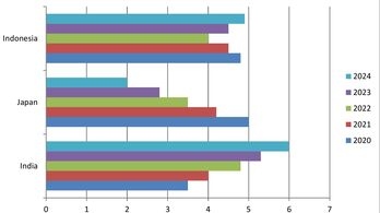
"The chart below shows the GDP growth per year for three countries between 2020 and 2024. Summarize the information by selecting and reporting the main features, and make comparisons where relevant."

🔎 Analyze the Chart
The first thing we have to do is take a quick look at the graph and identify trends, whatever pops out at the first glance.
📌 Key Observations:
India is on an upward trajectory in GDP.
Japan is on a downward trend.
Indonesia fluctuates but remains relatively stable.
We should also note each country’s GDP per year, especially in the starting and ending years:
In 2020, India had the lowest GDP, but by 2024, it was Japan.
When it comes to the highest GDP figures, it’s the opposite between these two countries.
💡 Grouping Strategy:
Since India and Japan have opposite trends, we can combine them in the same paragraph and compare them.
📝 Writing an Introduction
In the introduction, simply paraphrase the prompt, as it already introduces the graph.
✅ Prompt:
"The chart below shows the GDP growth per year for three countries between 2020 and 2024."
✅ Introduction:
"The bar chart shows the GDP growth of three countries—Indonesia, Japan, and India—from 2020 to 2024."
💡 Tip:
Don’t just paraphrase! If you can add specific details, do it. Here, we included:
✔ Country names
✔ Mentioned the type of chart (bar chart)
📌 Writing an Overview
In an overview, you need to highlight big trends or key features. Overview is extremely important to write band 7+ score in task achievement in IELTS writing task 1.
📌 Key Trends:
India had an upward trend.
Japan had a downward trend.
Indonesia fluctuated but remained relatively stable.
📄 Overview Statement:
"Overall, India saw an upward trend in its GDP, while Japan’s figure declined throughout the years. Meanwhile, Indonesia’s GDP remained relatively stable with some fluctuations."
📄 Writing Body Paragraphs
There are different ways to group the information. We could:
✔ Combine an upward trend with a downward trend
✔ Combine an upward trend with no change
✔ Combine a downward trend with no change
📌 For this sample essay, we will combine Japan and India because their trends are opposite, making it easier to compare and contrast.
📌 Body Paragraph 1 (India & Japan - Opposite Trends):
"India had the lowest GDP growth in 2020, at around 3.5%. However, due to continuous upward movement, the country’s GDP overtook those of other countries by 2022 and continued to rise, reaching its highest value of 7% by 2024. Japan followed the opposite trajectory, with its GDP declining each year, starting from the highest value of 6% in 2020 and dropping to the lowest figure of 2% by 2024."
✔ Reported figures accurately
✔ Made comparisons wherever possible
💬 Lexical Resource is easy to master for report writing—notice the use of academic and descriptive vocabulary like “reaching its highest value,” “dropping,” and “declining.” Explore more
📌 Body Paragraph 2 (Indonesia - Fluctuations & Stability):
"Indonesia’s numbers, on the other hand, remained relatively stable with some fluctuations. The country’s GDP was recorded at slightly less than 5% in the first year before dropping in the two subsequent years, then recovering to reach approximately 5% by 2024."
📌 Why use "On the other hand"?
It helps relate Indonesia’s figures to those of other countries. It also connects two paragraphs, which will help our score in coherence and cohesion.
🛠 Grammatical Range and Accuracy is also crucial here—note the use of both simple and complex sentence structures.
🎯 Final Takeaways
✔ Paraphrase the prompt carefully.
✔ Identify trends first, then write.
✔ Use comparison words to highlight differences (e.g., "opposite trajectory," "on the other hand").
✔ Report key figures without unnecessary details.
Have a look at the prompt and full essay again and other sample essays:
“The chart below shows the GDP growth per year for three countries between 2020 and 2024. Summarize the information by selecting and reporting the main features, and make comparisons where relevant.”
“The bar chart shows the GDP growth of three countries—Indonesia, Japan, and India—from 2020 to 2024.
Overall, India saw an upward trend in its GDP, while Japan’s figure declined throughout the years. Meanwhile, Indonesia’s GDP remained relatively stable with some fluctuations.
India had the lowest GDP growth in 2020, at around 3.5%. However, due to continuous upward movement, the country’s GDP overtook those of other countries by 2022, and continued to rise to reach its highest value of 7% by 2024. Japan followed the opposite trajectory, with its GDP declining each year, starting from the highest value of 6% in 2020 and dropping to the lowest figure of 2% by 2024.
Indonesia’s numbers, on the other hand, remained relatively stable with some fluctuations. The country’s GDP was recorded at slightly less than 5% in the first year before dropping in the two subsequent years after recovering to reach at approximately 5% by 2024.”
Other Sample Essays:
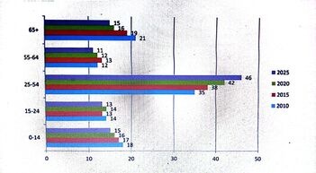
The bar chart below shows the percentage distribution of different age groups in the UK from 2010 to 2025.
Summarize the information by selecting and reporting the main features, and make comparisons where relevant.
“The bar chart illustrates the percentage distribution of different age groups in the UK between 2010 and 2025.
Overall, the 25-54 age group experienced the most significant growth over the years, whereas all other age groups saw a decline. The 65+ age group recorded the largest drop in percentage.
In 2010, the 25-54 age group accounted for 35% of the population. Over the years, this figure steadily increased, reaching 46% by 2025, making it the only category to grow substantially. In contrast, the younger age groups (0-14 and 15-24 years) experienced a gradual decline. The proportion of 0-14-year-olds fell from 18% in 2010 to about 15% in 2025, while the 15-24 age group dropped slightly from 14% to 13%.
Similarly, the 55-64 age group remained the least populated throughout the period, fluctuating slightly before settling at 11% in 2025. The most significant decline, however, was observed in the 65+ age group, which decreased from 21% in 2010 to 15% in 2025, a reduction of six percentage points.”
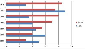
The bar chart shows the percentage of gym memberships held by men and women in the United Kingdom between 1980 and 2010 .
Summarize the key details by highlighting significant trends and making relevant comparisons.
Gym memberships held by men and women in the United Kingdom
“The bar chart illustrates gym memberships by gender over a 30-year period in the United Kingdom.
Overall, men had higher participation in the first two years and again in 2005, when their membership peaked. However, in all other years, women had a greater number of enrollments.
Male gym participation began at around 4.5% in 1980 and rose to 6% in 1985 before steadily declining over the next 15 years, reaching slightly below 4% in 2000. In contrast, female membership showed continuous growth during the same period, starting at about 3% in 1980 and climbing to 8% by 2000.
In 2005, the number of male members surged dramatically, hitting the highest point on the chart at approximately 9%, before experiencing a sharp decline to around 3% by 2010. Meanwhile, female participation saw a slight dip in 2005 but recovered in 2010, ending at slightly above 8%—almost three times the male figure.”
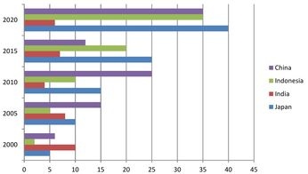
The chart shows internet speeds in four different countries in megabytes per second between 2000 and 2020s.
“The bar chart shows the average internet speed in Mbps in five different countries from 2000 to 2020.
Overall, all countries experienced upward mobility in their internet speed, except for India, which started with the highest value in 2000 and ended with the lowest figure in 2020. Japan saw the highest growth in its internet speed.
In India, internet speed was 5 Mbps in 2000, and it gradually decreased, reaching just over 5 Mbps by 2020. In contrast, the other countries experienced continuous growth. Japan's internet speed saw the highest increase, reaching 40 Mbps by 2020.
China's internet speed also grew over the years, being higher than the other countries in 2005 and 2010, but it didn’t reach its highest point. It dropped significantly to around 10 Mbps in 2015, before peaking at 35 Mbps by 2020. Indonesia steadily increased its internet speed, reaching a peak of 35 Mbps by 2020, similar to China.”
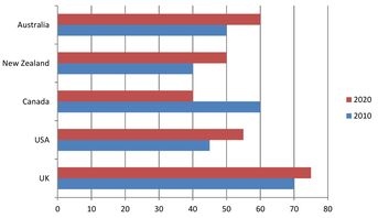
The bar chart below presents data on car ownership in five different countries in 2010 and 2020.
Summarize the key trends by selecting and reporting the main features, and make comparisons where relevant.
"The bar chart illustrates the percentage of people owning cars in five different countries in the years 2010 and 2020.
Overall, all countries experienced growth in car possession, except for Canada, which saw a substantial decline.
In 2010, the United Kingdom had the highest proportion of individuals with cars at 70%, followed closely by Canada at 60%. Half of Australia's population owned vehicles that year. The USA and New Zealand had lower figures, with car ownership ranging between 40% and 50% in the USA and exactly 40% in New Zealand.
By 2020, only Canada saw a significant drop in the share of its population with cars, decreasing from 60% to 40%. In contrast, the other countries experienced growth. Australia, New Zealand, and the USA saw increases of about 10%, while the UK recorded a more modest rise of approximately 5%."
📌 Learn more about:
🔹 Task Achievement – How to fully meet the requirements of IELTS Writing Task 1
🔹 Coherence and Cohesion – Make your ideas flow naturally and clearly
🔹 Lexical Resource – Use precise and varied vocabulary to boost your score
🔹 Grammatical Range and Accuracy – Write with variety and correctness




Resources
SUPPORT
+923184813655
© 2025. All rights reserved.
📍 RTS (Rise To Succeed), Near Erum Bright Academy, Daro Road, Dadu
