Mastering IELTS Writing Task 1: How to Write Pie Chart Reports
✍️ A Step-by-Step Guide to Writing a Band 9 Report In this guide, we will walk you through how to write a pie chart report effectively. You will learn how to analyze a pie chart, structure your response, and use clear, concise language to achieve a high band score. We will start with a single pie chart, then provide two additional sample answers featuring multiple pie charts.
3/30/20255 min read
In this guide, we will write a pie chart report together before providing additional Band 9 sample answers.
Pie charts are often presented alongside another pie chart or a different type of graph. However, in this guide, we will start with a single pie chart report and later provide two more examples featuring multiple pie charts.
🎯 4 Steps to Writing a Pie Chart Report
🔎 Step 1: Analyze the Chart
Carefully examine the chart, identify key trends, and note the most significant features.
📝 Step 2: Write an Introduction
Paraphrase the question prompt while introducing the data.
🌍 Step 3: Write an Overview
Summarize the biggest trends without giving too many details.
📑 Step 4: Write the Body Paragraphs
Describe the data in two well-organized paragraphs.
🏛 Model Structure for IELTS Writing Task 1 (Pie Chart)
📌 Paragraph 1 – Introduction (Paraphrase the prompt)
📌 Paragraph 2 – Overview (Highlight major trends)
📌 Paragraph 3 – First Main Feature
📌 Paragraph 4 – Second Main Feature
❓ Sample Question:
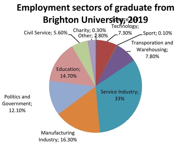
🟢 "The chart below shows the proportions of graduates from Brighton University in 2019 entering different employment sectors. Summarize the information by selecting and reporting the main features, and make comparisons where relevant."
🔎 Step 1: Analyze the Pie Chart
The first step is to analyze the data.
The service industry accounts for the largest proportion of graduates.
The manufacturing sector is the second-largest employer.
Other industries have smaller shares of graduates.
📌 Key Tip: In IELTS Task 1, you don’t need to describe everything. Focus on summarizing the main trends effectively.
📝 Step 2: Writing an Introduction
Your introduction should paraphrase the question prompt.
✅ Prompt:
"The chart below shows the proportions of graduates from Brighton University in 2019 entering different employment sectors."
✅ Paraphrased Introduction:
"The pie chart illustrates the job fields in which Brighton University graduates were employed in 2019."
📌 Key Tip:
Instead of just finding synonyms, change the form of words when necessary.
Example:
"Shows" → "Illustrates"
"Employment sectors" → "Job fields"
"Entering into employment" → "Were employed"
🌍 Step 3: Writing an Overview
The overview summarizes the key trends.
✅ Overview Example:
"Overall, nearly two-thirds of the graduates found work in the service industry, manufacturing, and education, while the remaining individuals were spread across various other fields, with “sport” and “charity” accounting for the lowest share."
📌 Key Tips for Writing an Overview:
Always start with "Overall" to signal the overview.
Avoid filler phrases like "It is evident that..." or "It is readily apparent that...".
Focus on the most noticeable trends (largest and smallest proportions).
📑 Step 4: Writing the Body Paragraphs
Since the data includes several industries, we organize the paragraphs based on largest and smallest proportions.
✅ Body Paragraph 1 (Largest Proportions):
"The service sector emerged as the most popular choice, employing one-third of the graduates. This was followed by manufacturing, which absorbed 16.3% of them, making it another significant employment area. A significant proportion also secured positions in education at 14.7% and politics and government at 12.1%."
📌 Key Tip:
When no major comparisons exist, present the data in logical order.
✅ Body Paragraph 2 (Smaller Proportions):
"Other industries had comparatively fewer Brighton University alumni. Transportation and warehousing employed 7.8%, while science and technology followed closely at 7.3%. The civil service, accounting for 5.6%, had twice as many graduates as other sectors. Charity and sports recorded the lowest employment rates, with only 0.3% and 0.1% of graduates entering these fields, respectively."
📌 Key Tip:
Use relative comparisons when possible (e.g., "twice as many graduates as other sectors").
Present numbers in different ways (e.g., "one-third," "16.3%," "twice as many") to show vocabulary range.
✅ Final Thoughts
By structuring your response in four clear steps, you can create a well-organized and high-scoring IELTS Task 1 report!
Have a look at the prompt and full essay again, along with other samples:
The chart below shows the proportions of graduates from Brighton University in 2019 entering different employment sectors. Summarize the information by selecting and reporting the main features, and make comparisons where relevant.
“The pie chart illustrates the job fields in which Brighton University graduates were employed in 2019.
Overall, nearly two-thirds of the graduates found work in the service industry, manufacturing, and education, while the remaining individuals were spread across various other fields, with “sport” and “charity” accounting for the lowest share.
The service sector emerged as the most popular choice, employing one-third of the graduates. This was followed by manufacturing, which absorbed 16.3% of them, making it another significant employment area. A significant proportion also secured positions in education at 14.7% and politics and government at 12.1%.
Other industries had comparatively fewer Brighton University alumni. Transportation and warehousing employed 7.8%, while science and technology followed closely at 7.3%. The civil service, accounting for 5.6%, had twice as many graduates as other sectors. Charity and sports recorded the lowest employment rates, with only 0.3% and 0.1% of graduates entering these fields, respectively.”
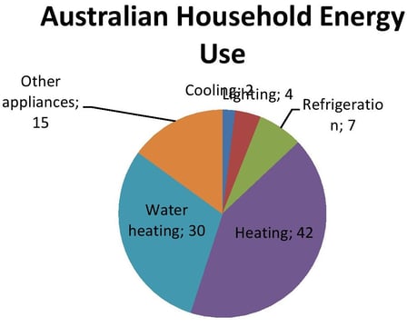
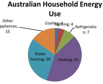
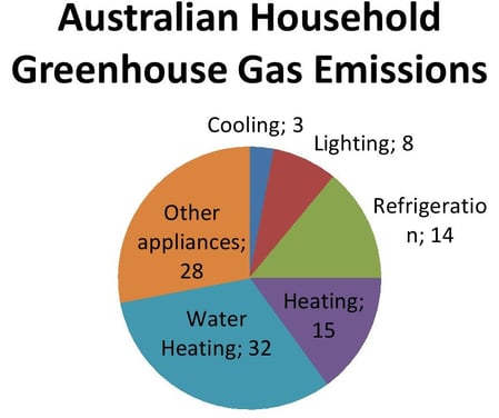
The first chart below shows how energy is used in an average Australian household. The second chart shows the greenhouse gas emissions which result from this energy use. Summarise the information by selecting and reporting the main features, and make comparisons where relevant.
“Pie charts show average energy use and greenhouse emission by different appliances in Australian households.
Overall, heating and water heating require almost two-thirds of energy use, with emitting just lower than half of gas emissions.
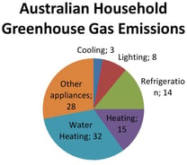
Heating requires the most usage of energy at 42%, followed by water heating at 30%. The latter emits the highest amount of gas at 32% while heating discharges 15% of gas. Other appliances require only 15% of overall energy use, with discharging 28% of greenhouse gases. Refrigeration and lightning emits the double of the energy they use, with the former using 7% and emitting 14% and the latter making use of 4% energy 8% of gas.
Cooling is the least energy needing process in Australian homes, with only consuming 2% of energy, and also emitting the lowest greenhouse gases at 3%.”
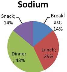
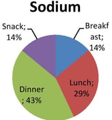
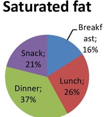
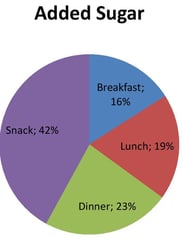
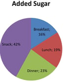
The charts below show the average percentages in typical meals of three types of nutrients, all of which may be unhealthy if eaten too much. Summarize the information by selecting and reporting the main features, and make comparisons where relevant.
"Pie charts illustrate the proportion of three types of nutrients—sodium, saturated fats, and added sugar—in typical meals consumed in the USA.
Overall, dinner and lunch account for the highest and the second highest proportions of sodium and saturated fat among all four meals, whereas snacks contain significantly more added sugar compared to other meals.
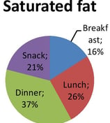
Sodium intake is highest at dinner, making up 43% of the total consumption, followed by lunch at 29%. The intake percentage of this type of nutrient in snack and breakfast is same, at 14%. Similarly, saturated fat is most prevalent in dinner, accounting for 37%, while lunch and snacks comprise of 26% and 21% of the nutrient, respectively. Breakfast has the lowest proportion, at 16%.
In contrast, added sugar is consumed the most through snacks, which make up 42% of the total intake. Dinner ranks second, with 23%, while lunch and breakfast contribute 19% and 16%, respectively."

Resources
Free IELTS preparation materials and assessments available.
Support
Contact
jhatiyalxeetioan@gmail.com
+923413477535
© 2025. All rights reserved.
