How to Write a Band 9 Line Graph Report for IELTS Writing Task 1
Struggling with IELTS Writing Task 1? Learn how to write a perfect line graph report with a simple 4-step approach: Analyze, Write an Introduction, Give an Overview, and Develop the Body Paragraphs. This guide includes sample answers, key strategies, and useful vocabulary to help you achieve a high band score! 🚀
IELTS WRITING TASK 1
3/30/20256 min read
We will write a line graph report step by step before providing some samples.
📝 Writing a Line Graph Report in 4 Steps:
1️⃣ Analyze the Chart
2️⃣ Write an Introduction
3️⃣ Write an Overview
4️⃣ Write the Paragraphs
📌 Model Structure for IELTS Writing Task 1 (Line Graphs):
📄 Paragraph 1 – Introduction
📄 Paragraph 2 – Overview
📄 Paragraph 3 – First Main Feature
📄 Paragraph 4 – Second Main Feature
Here is our sample question:
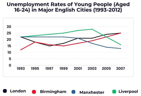
The line graph below shows changes in the youth unemployment rate from 1993 to 2007. Summarize the information by selecting and reporting the main features and making comparisons where relevant.
🔍 Analyze the Chart
The first thing we need to do is take a quick look at the graph. Identify the biggest and smallest trends, along with the highest change—whether an increase or decrease. Simply find anything that stands out.
The key thing to keep in mind is that you do not have to report everything—only what is comparatively relevant, whether it is a similarity or a stark difference.
A few things that stand out in the graph are:
✅ The unemployment rate in Birmingham and London increased.
✅ The unemployment rate in Manchester and Liverpool decreased.
✅ Birmingham had the lowest rate at the start but ended with the highest, peaking at 25%.
✅ All other cities started from the same point, just below 25%.
✅ The peak and lowest point of each city.
These are the details that need to be included in our paragraphs. We do not need to mention every minor detail. The question states: "Summarize the information by selecting and reporting the main features," so we will simply report the key trends.
📌 Writing an Introduction
In the introduction, simply paraphrase the prompt, as the prompt itself introduces the graph.
Prompt: The line graph below shows changes in the youth unemployment rate from 1993 to 2007.
Introduction: The line graph illustrates the unemployment rate among young people aged 16–24 in four English cities—London, Birmingham, Manchester, and Liverpool—from 1993 to 2007.
💡 Tip: Sometimes, the prompt omits important information, which you can add to the introduction. For instance, this prompt does not include the city names, so we mention them. However, if there were ten cities, we obviously would not list each one here.
📌 Writing an Overview
In this section, focus on the main features of the graph. The most noticeable trend in this graph is that two lines increase while the other two decrease. This is exactly what we will highlight:
Overview: Overall, Birmingham and London experienced an upward trend by the end of the period, with Birmingham recording the highest increase in youth unemployment. In contrast, the unemployment rate in Manchester and Liverpool declined by 2007.
💡 Tip: Always start your overview with "Overall," to make it clear that this paragraph gives a summary of the whole report.
📌 Writing Body Paragraphs
We need to divide the information into two sections. There are multiple ways to do this.
🔹 We can divide the data based on increase vs. decrease—the first paragraph focusing on increasing trends and the second on decreasing trends.
🔹 Another approach is to group cities based on their ending points. Since London and Birmingham peak at the same level by the end, we can combine them into a paragraph based on that.
The key takeaway is that you can use any logical approach to organize your paragraphs—choose what seems easiest.
📄 First Body Paragraph:
"Birmingham had the lowest unemployment rate in 1993, at approximately 12%. However, its figures rose over the years, despite some fluctuations, reaching a peak of 25% by 2007. Similarly, London’s unemployment rate started at around 22% in 1993, dropped to 15% in 1997, but then surged to match Birmingham’s peak of 25% by the end of the period."
🔹 Here, we have reported the data of two cities in detail.
🔹 We have also drawn a comparison, as both saw an overall increase in their unemployment rate and ended at the same peak.
📄 Second Body Paragraph:
"Liverpool’s unemployment rate steadily increased, peaking at nearly 28% in 2003—the highest among the four cities—before declining to just over 15% in 2007. Meanwhile, Manchester experienced a gradual decline, reaching its lowest point of just under 15% by 2007."
🔹 Since Liverpool and Manchester both saw a decline over the period, they have been combined in the same paragraph.
🔹 We also ensured that we mentioned the highest point in the data, which was achieved by Liverpool.
💡 Final Tip: There is much more that we could have written—for example, detailing how each city’s unemployment rate changed year by year. However, we only focus on the main features, as required by the task.
Below, you will find the complete report we have just finished writing, along with two other sample line graph reports.
The line graph below shows changes in the youth unemployment rate from 1993 to 2007. Summarize the information by selecting and reporting the main features and making comparisons where relevant.
"The line graph illustrates the unemployment rate among young people aged 16-24 in four English cities—London, Birmingham, Manchester, and Liverpool—from 1993 to 2007.
Overall, Birmingham and London experienced an upward trend by the end of the period, with Birmingham recording the highest increase in youth unemployment. In contrast, the unemployment rate in Manchester and Liverpool declined by 2007.
Birmingham had the lowest unemployment rate in 1993, at approximately 12%. However, its figures rose over the years, despite some fluctuations, reaching a peak of 25% by 2007. Similarly, London’s unemployment rate started at around 22% in 1993, dropped to 15% in 1997, but then surged to match Birmingham’s peak of 25% by the end of the period.
Liverpool’s unemployment rate steadily increased, peaking at nearly 28% in 2003—the highest among the four cities—before declining to just over 15% in 2007. Meanwhile, Manchester experienced a gradual decline, reaching its lowest point of just under 15% by 2007."
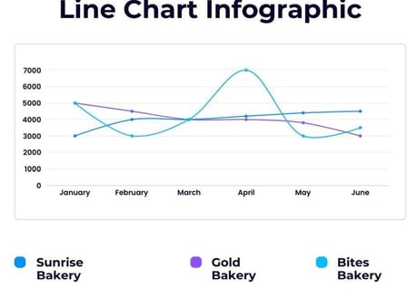
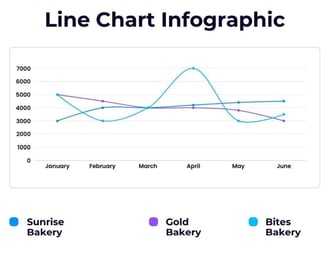
The line graph shows the monthly revenue of three different bakeries: Sunrise, Gold, and Bites. Summarize the information by selecting and reporting the main features and making comparisons where relevant.
"
"The line graph shows the monthly revenue of three different bakeries: Sunrise, Gold, and Bites.
Overall, Sunrise Bakery experienced a gradual and consistent upward trend, whereas the other two bakeries saw a decline in their monthly figures over the years.
Sunrise Bakery had the lowest revenue at the start of the year, with 3,000 dollars in January, compared to Gold Bakery and Bites Bakery, both of which began with sales worth 5,000 dollars. However, while Sunrise Bakery saw a steady increase and ended with the highest sales by June, the revenue of Gold Bakery and Bites Bakery declined over time.
Gold Bakery followed a relatively stable downward trend, ending with the lowest revenue of 4,000 dollars in June. Meanwhile, Bites Bakery’s figures fluctuated; after hitting a low of 3,000 dollars, it rebounded to a peak of 7,000 dollars in June before following a downward trajectory, reaching approximately 3,500 dollars by the end of the period."
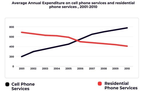
The graph shows average annual expenditures on cell phone and residential phone services between 2001 and 2010. Summarize the information by selecting and reporting the main features, and make comparisons where relevant. Write at least 150 words.
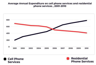
"The line graph depicts the average annual expenditure on mobile and landline phone services from 2001 to 2010.
Overall, spending on mobile phone services experienced a steady upward trend, whereas expenditure on landline services declined over the period.
At the beginning of the period, approximately $200 was spent on mobile phone services, while more than three times that amount was allocated to landline services. Expenditure on mobile phone services continued to rise, reaching $600 within the next five years and surpassing the amount spent on landlines, which declined to just over $400 during the same period.
The upward trajectory of mobile phone spending persisted, peaking at nearly $800 by the end of the period. Meanwhile, landline service expenditure experienced a sharp decline in 2006, followed by a steady decrease for the remainder of the period, ultimately reaching approximately $400 in 2010."

Resources
Free IELTS preparation materials and assessments available.
Support
Contact
jhatiyalxeetioan@gmail.com
+923413477535
© 2025. All rights reserved.
